# 讲解Web Components实现类Element UI中的Card卡片

> 作者/来源: UCloud 运营管理员
> 发布时间: 2023-02-27T14:27:00.000Z
> 分类: 解决方案
> 原文链接: http://117.50.162.249:3000/yun/articles/584

---

# 讲解Web Components实现类Element UI中的Card卡片

> 来源: https://www.ucloud.cn/yun/130322.html
> 作者: 3403771864
> 发布日期: 发布于2023-02-27 22:27

众所周知 Web Components 是一个浏览器原生支持的组件化方案，这个能够创建新的自定义、可封装、可重用的HTML 标记。同时也可以不用加载任何外部模块，能够直接在浏览器中查看。今天我们想讲的就是如何使用 Web Components 实现一个类 Element UI 中的 Card 卡片组件。
![1.png](https://ucloud-blog.cn-bj.ufileos.com/articles/130322/images/130322_000.png)

　　先进变成如雨后春笋，出现了很多优秀的框架，如：Vue、React、Angular等等，对于开发效益有大大提升。

　　其中我们知道在组件化开发发挥了至关重要的作用，但要注意在组件化开发都需要依赖第三方框架，编译打包之后才能在浏览器正常使用。

　　这里给大家给提出原生组件Web Components，与之第三方框架使用起来更简单直接，符合直觉，不用加载任何外部模块，代码量小。

　　Web Components 核心组成

　　自定义元素（custom element），使用window.customElements.defineAPI注册

　　Shadow DOM隔离，影藏标记结构、样式和行为

　　这里要说<template>中定义标记结构、样式，多次重用。利用slot插槽、命名插槽，可以传入定制化的结构UI，使用上类似Vue中的slot插槽

　　1. Custom Elements

　　自定义的 HTML 标签，称为自定义元素（custom element）。根据规范，自定义元素的名称必须包含连词线-，用与区别原生的 HTML 元素。所以，<com-card>不能写成<comcard>。

```
　　<div id="custom-card" class="com-card">
　　<div class="com-card-head">
　　<slot name="head"></slot>
　　</div>
　　<div class="com-card-body">
　　<slot></slot>
　　<div class="link-wrap">
　　<a class="link" href="" title=" rel="external nofollow" rel="external nofollow" "></a>
　　</div>
　　</div>
　　</div>
　　<script>
　　class ComCard extends HTMLElement {
　　constructor() {
　　super()
　　var tplEle = document.getElementById('custom-card')
　　this.append(tplEle)
　　}
　　}
　　window.customElements.define('com-card', ComCard)
　　</script>
```

　　以上就可以注册了浏览器可识别渲染的一个自定义元素标签。

　　2. Shadow DOM

　　Shadow DOM 是对DOM的一个封装。可以将标记结构、样式和行为隐藏起来，并与页面上的其他代码相隔离，保证不同的部分不会混在一起，可使代码更加干净、整洁。

　　使用自定义元素的this.attachShadow()方法可以开启Shadow DOM。

```
　　class ComCard extends HTMLElement {
　　constructor() {
　　super()
　　var shadow = this.attachShadow({mode: 'closed'}) // open
　　var tplEle = document.getElementById('custom-card')
　　shadow.appendChild(tplEle)
　　}
　　}
　　window.customElements.define('com-card', ComCard);
```

　　其中参数{ mode: 'closed' }，表示Shadow DOM是封闭的，外部是无法访问的。

　　3. templates 和 slots

　　因为组件的样式应该与代码封装在一起，只对自定义元素生效，不影响外部的全局样式。所以，可以把样式写在<template>里面，这样作为自定义元素结构的基础可以被多次重用。

```
　　<template id="custom-card-template">
　　<style>
　　.com-card {
　　}
　　</style>
　　<div class="com-card">
　　</div>
　　</template>
　　<script>
　　class ComCard extends HTMLElement {
　　constructor() {
　　super();
　　var shadow = this.attachShadow({mode: 'closed'}) // open
　　var tplEle = document.getElementById('custom-card-template')
　　var content = tplEle.content.cloneNode(true)
　　shadow.appendChild(content)
　　}
　　}
　　window.customElements.define('com-card', ComCard);
　　</script>
```

　　完整代码

```
　　<!DOCTYPE html>
　　<html>
　　<head>
　　<meta charset="UTF-8">
　　<title>Web Component</title>
　　<style>
　　* {
　　box-sizing: border-box;
　　}
　　body {
　　font-size: 14px;
　　}
　　.box {
　　padding: 5px 0 30px;
　　}
　　.box .caption {
　　display: none;
　　}
　　.box h1 {
　　text-align: center;
　　}
　　.box li {
　　color: #666;
　　font-size: 14px;
　　line-height: 1.8;
　　margin-top: 15px;
　　}
　　.img {
　　display: block;
　　width: 80%;
　　margin: 0 !important;
　　}
　　.card-head {
　　display: flex;
　　justify-content: space-between;
　　align-items: center;
　　}
　　.card-title {
　　color: #333;
　　font-size: 16px;
　　}
　　.card-head-btn {
　　color: #409eff;
　　cursor: pointer;
　　text-decoration: none !important;
　　}
　　.card-head-btn:hover {
　　text-decoration: none;
　　}
　　</style>
　　</head>
　　<body>
　　<div class="box">
　　<h1>Web Component</h1>
　　<com-card data-show-head="0" data-url="https://tiven.cn" data-title="天问博客">
　　<div slot="head" class="card-head">
　　<div class="card-title">卡片名称</div>
　　<a class="card-head-btn">操作按钮</a>
　　</div>
　　<img class="img" src="https://tiven.cn/static/img/kpl-sunwukong-a3Lt-ed2NG9r4NFDm_9DA.jpg" alt="天問">
　　</com-card>
　　<com-card data-show-head="1" data-url="https://tiven.cn/p/de241e23/" data-title="Vite+Vue3+Vant快速构建项目">
　　<div slot="head" class="card-head">
　　<div class="card-title">卡片名称</div>
　　<a class="card-head-btn" onclick="hello()">操作按钮</a>
　　</div>
　　<img class="img" src="https://tiven.cn/static/img/kpl-xuance-JqX71qH7aTflHV_gqvhIc.jpg" alt="天問">
　　<ol>
　　<li>君不见黄河之水天上来，奔流到海不复回。</li>
　　<li>君不见高堂明镜悲白发，朝如青丝暮成雪。</li>
　　<li>天生我材必有用，千金散尽还复来。</li>
　　</ol>
　　</com-card>
　　</div>
　　<template id="custom-card-template">
　　<style>
　　.com-card {
　　min-width: 200px;
　　min-height: 100px;
　　border-radius: 4px;
　　border: 1px solid #ebeef5;
　　background-color: #fff;
　　overflow: hidden;
　　color: #303133;
　　transition: .3s;
　　box-shadow: 0 2px 12px 0 rgba(0, 0, 0, 0.1);
　　}
　　.com-card-head {
　　padding: 10px 20px;
　　border-bottom: 1px solid #ebeef5;
　　box-sizing: border-box;
　　}
　　.com-card-body {
　　padding: 20px;
　　}
　　.link-wrap {
　　text-align: left;
　　padding-top: 20px;
　　}
　　.link {
　　display: inline-block;
　　height: 42px;
　　line-height: 43px;
　　padding: 0 30px;
　　text-align: center;
　　cursor: pointer;
　　color: #fff;
　　background-color: #409eff;
　　border-color: #409eff;
　　-webkit-appearance: none;
　　box-sizing: border-box;
　　outline: none;
　　transition: .1s;
　　font-weight: 500;
　　-moz-user-select: none;
　　-webkit-user-select: none;
　　-ms-user-select: none;
　　font-size: 14px;
　　border-radius: 4px;
　　text-decoration: none !important;
　　}
　　</style>
　　<div class="com-card">
　　<div class="com-card-head">
　　<slot name="head"></slot>
　　</div>
　　<div class="com-card-body">
　　<slot></slot>
　　<div class="link-wrap">
　　<a class="link" href="" title=" rel="external nofollow" rel="external nofollow" "></a>
　　</div>
　　</div>
　　</div>
　　</template>
　　<script>
　　class ComCard extends HTMLElement {
　　constructor() {
　　super();
　　var shadow = this.attachShadow({mode: 'closed'}) // open
　　var tplEle = document.getElementById('custom-card-template')
　　var content = tplEle.content.cloneNode(true)
　　var attrList = Array.from(this.attributes);
　　var props = attrList.reduce((prev, item)=>{
　　prev[item.name] = item.value
　　return prev
　　}, {})
　　if (props['data-show-head']!=='1') {
　　var head = content.querySelector('.com-card-head')
　　head.remove()
　　}
　　var urlEle = content.querySelector('.link')
　　if (props['data-url'] && props['data-title']) {
　　urlEle.href = props['data-url']
　　urlEle.title = props['data-title']
　　urlEle.innerText = props['data-title']
　　} else {
　　urlEle.remove()
　　}
　　shadow.appendChild(content)
　　}
　　connectedCallback(){
　　//在这里发送数据请求（Ajax）
　　console.log('connectedCallback')
　　}
　　//被从文档DOM中删除时调用
　　disconnectedCallback(){
　　console.log('disconnectedCallback')
　　}
　　//被移动到新的文档时调用
　　adoptedCallback(){
　　console.log('adoptedCallback')
　　}
　　//当增加、删除、修改自身的属性时被调用
　　attributeChangedCallback(){
　　console.log('attributeChangedCallback')
　　}
　　}
　　window.customElements.define('com-card', ComCard);
　　function hello() {
　　alert('Hello，Web Component')
　　}
　　</script>
　　</body>
　　</html>
```

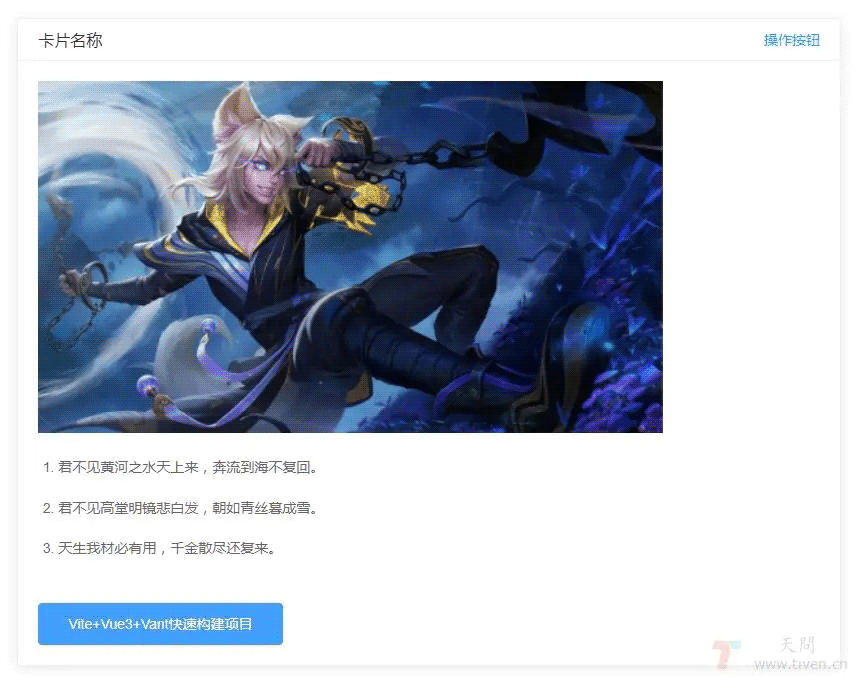
　　最终效果如上图所示

　　Web Components vs Vue Components

| Vue Component | Web Component |
| --- | --- |
| data | 实例属性 |
| props | attributes |
| watch | observedAttributes、attributeChangedCallback |
| computed | getters |
| methods | class methods |
| mounted | connectedCallback |
| destroyed | disconnectedCallback |
| style scoped | template中的style |
| template | template |

　　Web Components 生命周期回调函数

　　connectedCallback：当 custom element首次被插入文档DOM时，被调用。

　　disconnectedCallback：当 custom element从文档DOM中删除时，被调用。

　　adoptedCallback：当 custom element被移动到新的文档时，被调用。

　　attributeChangedCallback: 当 custom element增加、删除、修改自身属性时，被调用。

　　优点 and 缺点

　　优点：

　　浏览器原生支持，无需第三方库

　　语义化

　　复用性，移植性高

　　在不同的tema也可以共用组件

　　缺点：

　　需要操作DOM

　　不同浏览器无法兼容，体验不好

　　和外部css交互比较难

　　基于web components的框架

　　LitElement是一个快速、轻量级的 Web UI 框架。使用lit-html来渲染元素。

　　Polymer是一款实用、基于事件驱动、封装性和交互性强的 Web UI 框架。

　　Omi是基于 Web 组件的跨框架跨平台框架 。移动端 & 桌面 & 小程序。

    本篇内容已全部讲述完毕，欢迎关注更多后续精彩内容！